New look, bigger impact: All about OnHand’s rebrand
When OnHand first started, all the way back in 2019, we never would have imagined that we’d end up here, helping OnHanders all over the world do good and feel good.
Now that we’re facilitating tens of thousands of OnHand actions a year, we reckoned it was time for a refresh. We’ve been working with Fiasco Design to rebrand in a way that reflects our values and shows that we’re here for impact every day of the week!
Who are we, really?
We’ve been thinking long and hard about who we are, what we do, and why we do it. Our mission has always been to make it as easy as possible for people to do more good in the world. By curating convenient ways for individuals and teams to get stuck in and do more of what they care about, we’ve always put the people first…
…and we want our brand to reflect that. We’ve added a ton of our personality into our new look; just like us, it’s extra encouraging, surprisingly simple, perma-positive, and fully feel-good!
Rest assured, we’ve done a lotta streamlining over the past few months to settle on a brand that feels fully ‘OnHand’. Whatever your impact looks like – we’ve got you covered.
So, why the change?
If you’ve been with us for a while, you can probably recognise our iconic OnHand green anywhere (we know we can). There’s no hard feelings towards our old look – in fact, it’s been pretty great to us so far – but we just felt it was time for a change. We’re only getting bigger, and we wanted a brand that reflected that.
Sanjay’s appearance on Dragons’ Den couldn’t have come at a better time. Truth be told, Steven Bartlett wasn’t a huge fan of how the app looked. We won’t beat around the bush; he said it was “really, really ugly” (and you can watch it as many times as you like here).
When Sanjay’s pitch on Dragons’ Den aired, we’d already got our heads stuck into rebrand thoughts, so Steven’s comments were pretty timely. It was great to know we were heading in the right direction; we’d outgrown the old brand, and we couldn’t wait to get stuck into the new one.
Ready for it? Let’s dive right in.
Our lovely new logo
Our logo is the face of our brand. Our new logo has been hand-crafted to reflect our identity and who we truly are; connecting those who need help to those who want to help, whilst also conveying all the feel-good we get from doing just that.
We enlisted the help of Alec Tear, an independent lettering artist, to give us a hand. If you look super close, you’ll catch all the neat details, like the offset edges that emulate hand-drawn qualities and link to our community feel, or the arched crossbar in the ‘H’ for that uplifting, positive feeling.
Our sunshine yellow logo (with its dark teal alternate) just radiates positive vibes, and never you fear – we’re going to be so easy to find on your phone screen. We’re bright, we’re happy, and, obviously, we’re feeling good. A bespoke logo for our bespoke, feel-good platform – sounds so correct to us.
Oh, and by the way, our name has had a little uplift. Noticed it yet? Just take a look at that big, beautiful capitalised ‘O’. That’s right – we mean business.
Our thrilling typography
As well as revamping our logo, we’ve also made some changes to our typography.
Agrandir is our new main brand font. It’s playful and radiates positivity, just like us! Agrandir has a load of characteristics that reflect our new logo, like tapered letters and cheeky curves.
Alongside Agrandir, we’ve pulled out Plus Jakarta as a supporting typeface. The open and geometric feel of Plus Jakarta is great for readability, especially in contrast with Agrandir, so we can make sure we get across all the info we need to, in the best possible way.
Our cheerful colours
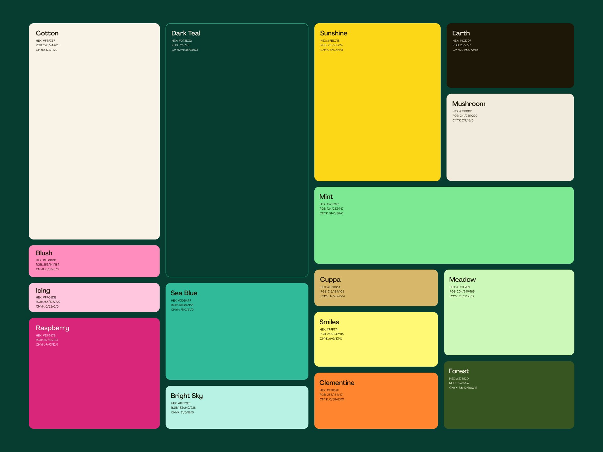
We’re so stoked about our new colour palette, because we just know it encapsulates everything we love about OnHand.
Our core palette is all about getting in touch with nature – we’re setting the foundations with soft cotton and mushroom shades, contrasted with deep, bold dark teal and earth shades. One of the biggest changes on our journey has been the shift to climate-caring. Our planet-saving pledges and missions are some of the most popular on the app, so we want to revisit all our roots and create a really natural feel with our colour palette.
On top of our core palette, we use secondary colours in pinks, teals, yellows, and greens. Bright, friendly, and feel-good, our colours represent who we are to a T, and we just know they’re going to get everyone else excited too.
Our feel-good photography style
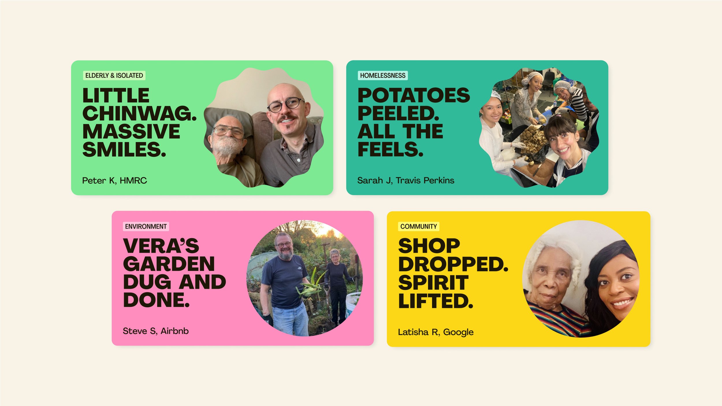
Just like us, we like to keep our photography authentic, friendly and candid. We aim to capture meaningful moments, whether that’s individuals completing missions, team building tasks or the connections formed between people.
Any brand photography we use will show how our app impacts the world in a positive way, with candid, natural shots of individuals and teams taking parts in missions. However, our strength lies in the pics our OnHand heroes snap while doing good…
It’s pretty fitting that our OnHand heroes help us show amazing impact. By asking OnHanders to take selfies when they complete missions, we know we’re 100% authentic. Of course, no one has to snap a pic when they’re doing good, but honestly? Our OnHanders kinda love it, and we’re the only impact platform out there who consistently use real people in our brand photography. Let’s give it up for our OnHand heroes!
Our charming custom emojis
Yeah, we’ve landed ourselves a set of custom emojis, no biggie.
Our custom emojis play a huge part in making our brand distinctive, fun, and approachable. We love a good emoji here at OnHand HQ, and our custom emojis bring a human quality and charm to our designs that reflect how much of ourselves we put into making an impact.
Not only are they super cute, our custom emojis are also functional! We can use them to easily showcase the different types of missions on offer; we’re making doing good clear and simple, and the visuals of our emojis will do just that. Teacup emoji, dog emoji, phone emoji; mic drop.
Our bombastic brand shapes
Our custom emojis aren’t the only new, exciting visual part of our new brand. We’ve adopted a series of brand shapes that are going to build the foundations of all of our graphic elements. Whether we’re sharing images or text, we know exactly what we want to share and we’re making sure everyone knows too.
As part of our new brand shapes, we’re doubling down on mission and name badges. Sharing a feel-good selfie from one of our OnHand heroes? You know they’re getting all the cred they deserve! We wouldn’t be where we are without all of the incredible OnHanders who use the app and actually do good; we think it’s about time that we put them right at the forefront.
…Is that all?
We’re just kidding; we know these are some pretty big changes. We’re still reeling too!
We’ve practically been vibrating out of our seats in the run-up to the rebrand launch. We’re seriously enamoured with our new OnHand brand – maybe we’re biased, but Fiasco Design have helped us bring something super special to the table.
And don’t worry – we’re still the same OnHand under it all! At the end of the day, we’re here to help you get educated, get motivated, and make some serious impact. Whether you’re doing good for your community or for the planet, one thing’s for sure; we’re helping you make the impact you want.
If that’s not enough for you, Fiasco Design has summed it all up for you in this nifty video:
Liking our style? Let’s chat! https://www.beonhand.co.uk/book-a-demo


